Continuing the theme of writing up my work on optimizing street sweeping routes for Glendale, California, in this post I’m going to talk about how I made an animation to visualize the solutions generated by Google’s OR-Tools.
Assessing solver output
I’ve been using OR-Tools for a while now to solve various kinds of routing problems. The OR-Tools solver will generate the best solutions it can, given the problem’s parameters and constraints. However it isn’t always clear how to express a constraint in terms the solver can use, nor how to measure if a constraint has been violated or not.
Take for example the street sweeping problem that we’ve been working on recently. Suppose the solver comes up with a set of routes that wander all over the city. While they may be efficient, routes with a lot of spatial spread will likely violate existing parking regulations, and will be difficult for human drivers to memorize and execute. There is no easy way to say “prefer to keep the routes tight”, and there is no clear measure for a route’s spatial spread.
For most of these soft constraints, a good way to evaluate the result is to check the routes visually. Because OR-Tools just produces a list of nodes to visit, it is up to the analyst to make his or her own visualization.
As described in the previous few posts about the street sweeping problem, I have been using a PostgreSQL/PostGIS database for handling the OpenStreetMap street network of the city. Because the database is already up and running, I decided to use the database plus QGIS to visualize the routes. My approach is as follows.
- Run the solver and get an assignment of streets to vehicles
- Save the route data to a new GIS-enabled database table
- Load the geo-table into QGIS using its PostGIS database connector
- Animate each route
I originally expected that simply generating a map would be good enough (step 3), but it turned out I really needed to animate each route to properly evaluate the impact of changes to the solver’s constraints. It is hard to assess a tangled mass of routes; it is somewhat easier to look at a route as it unfolds and decide if it is good or bad.
This blog post goes into the details for steps 2, 3, and 4—I’ll postpone discussion of the solver part for a future post. The next section describes how to convert the solver’s list of streets into a complete route that is ready to store in the database. Next I show how to display that table in QGIS as a map of streets. Then I finish up by describing how I animate the routes. The animations initially were pretty much impossible to view, as they were super choppy and gave me motion sickness. So like a true propeller-head, I used math and PostGIS to produce a much smoother animating technique.
The end result is that we can now tweak the solver, run it, and with just a little bit of effort, create an animated visualization of each route to see if the solver tweaks worked as expected. This blog post describes the whole process, as well as additional details about my approach that I hope will be illuminating rather than confusing.
From optimization output to database table
The OR-Tools solver generates an assignment as an ordered sequence of nodes to visit. For this problem, I’ve converted the regular transportation network into its Line Graph dual. Each node represents a curb-specific street segment that must be visited (swept) just once. The line graph has been constructed such that each curb can only transition to valid neighboring curbs, although the solver currently does allow U-turn movements.
Note that the solution is only the nodes to sweep. It does not contain any information on nodes that are visited but not swept. That is, if a vehicle has to deadhead (travel without sweeping) over several streets in order to reach the next curb to sweep, this path is not included in the solution produced by the solver. Before I can save the solution to the database, the intermediate, non-swept nodes must be inserted into the solution in order to create the full route.
As part of my solver, I create and use something called a “deadhead dimension” to account for distance traveled without sweeping. This dimension is also useful for spotting when the solver’s solution needs to be augmented with unswept streets. The code to the right (extracted from the output function) shows this process. I’ve dropped everything unrelated to building up the sequence of streets that are visited, and so it probably won’t run if you are foolish enough to cut and paste it into your own program.
For each vehicle, the loop steps through each of the nodes (in order)
that have been assigned to the vehicle by the solver. The list is
started with the call to index = routing.Start(vehicle_id); the
index value is incremented each iteration with the call to index = assignment.Value( routing.NextVar(index)); and the stopping condition
of the loop is to check if the route is over with the code
routing.IsEnd(index).
Within the loop, the current state of the deadhead dimension is
retrieved. If the difference between the current and prior deadhead
values is greater than zero, then the prior map node is not directly
connected to the current map node (there is a non-zero deadhead
movement). In this case, a call is made to the get_path() function.
This function hits the database, and using the pgRouting function
pgr_dijkstra, retrieves the shortest path between the prior map node
and the current map node in the curbside line graph. The function
returns all of these intermediate nodes that must be traversed in
order to get from the previous node to the current node. These nodes
are added as tuples [node,False] to indicate that there is no
sweeping, while the current node is always added to the list as the
tuple [mapnode,True], with True indicating that the link is
being swept by the vehicle.
Inserting the extra links traversed between two swept nodes
deadhead_dimension = routing.GetDimensionOrDie('deadhead')
for vehicle in vehicles.vehicles:
    link_sequence=[]
    vehicle_id = vehicle.index
    index = routing.Start(vehicle_id)
    prev_mapnode = None
    prev_deadhead = 0
    while not routing.IsEnd(index):
        node = manager.IndexToNode(index)
        mapnode = nodes[node]
        deadhead_var = deadhead_dimension.CumulVar(index)
        deadhead = assignment.Value(deadhead_var)
        deadhead_diff = deadhead - prev_deadhead
        if prev_mapnode is not None:
            if deadhead_diff > 0:
                # more than one segment traversed
                link_sequence.extend(
                    spatial.get_path(prev_mapnode,mapnode))
            else:
                link_sequence.append([mapnode,True])
        prev_mapnode = mapnode
        prev_deadhead = deadhead
        index = assignment.Value(routing.NextVar(index))
Saving the ordered list of visited links is shown in the next code
block. The table name is a variable that is defined on the command
line for the program, and so it needs to be inserted into the database
commands. According to the Pyscopg
docs, the correct way to convey the
table name to the psycopg engine is to use the sql.SQL(…).format( sql.Identifier( table_name )) construct. Similarly, the variables
used in the insert query are passed as parameters via the second
argument to the cur.execute( query, params ) command.
These steps might look a little bit convoluted, and a newcomer to accessing databases programmatically might be tempted to just construct the full query string via string concatenation. This is a mistake, as it can lead to SQL injection attacks. The psycopg docs state unequivocally:
Never, never, NEVER use Python string concatenation (+) or string parameters interpolation (%) to pass variables to a SQL query string. Not even at gunpoint.
See the page at http://initd.org/psycopg/docs/usage.html#passing-parameters-to-sql-queries.
After dropping any existing table and then creating the table, each
line is inserted sequentially in a loop, and then the entire sequence
of commands is committed at once with the line self.conn.commit().
I could probably shave a few milliseconds off the execution time by
constructing a single bulk insert command or by using a COPY command,
but there are only a few thousand points at most to enter, so the
performance gains would be minimal. (A problem with more than a few
thousand links to optimize would be intractable for the solver, so I
don’t have to worry yet about having millions of entries to save.)
Saving the ordered sequence of links to the database
def sequence_to_table(self,vsequence,table_name):
    sequence = 0
    insert_query_string = """insert into {} (veh,sweep,linkid,geom)
    select %s,%s,%s,c.curb_geom as the_geom
    from curbs_v2_graph c
    where c.curbid =%s"""
    insert_query = sql.SQL(
                     insert_query_string
                          ).format(sql.Identifier(table_name))
    with self.conn.cursor() as cur:
        cur.execute(
            sql.SQL(
                "Drop table if exists {}"
                   ).format(sql.Identifier(table_name)))
        cur.execute(
            sql.SQL("""
CREATE TABLE {} (
   id serial, linkid integer, veh integer,
   sweep boolean default TRUE,
   geom geometry(LINESTRING,4326) )
                   """).format(sql.Identifier(table_name)))
        for (veh,sequence) in vsequence.items():
            for row in sequence:
                # basic idea.  Save a table.
                # Each row has shape,sequence number
                sweep = row[1]
                linkid = row[0]
                cur.execute(
                   insert_query,(veh,sweep,linkid,linkid))
        self.conn.commit()
One final note. The insert command explicitly adds the geometry of
the link to the table. The curb id is used to scoop up
the geometry with the snippet c.curb_geom … from curbs_v2_graph c where c.curbid = %s This violates the nice neat normalized database I
usually maintain. A better (normalized) solution would be to just
save the curb id to the table, and then query the geometry with a
JOIN. However, the way I intend to use this table is with QGIS. It
is much easier in QGIS to access tables with the geometries already
included. Years ago when I was more concerned with maintaining
normalized databases, I tried creating a view to merge the geometry
information, only to find that (at the time) QGIS did not support
views. That has been fixed, but the path of least resistance is still
to just stuff the geometries in the tables and live with the
denormalizing.
Visualizing with QGIS
As I mentioned in the previous section, the generated route tables can be visualized easily with QGIS. The first step to using QGIS is to get it up and running. These days I do almost everything using containers (“Docker all the things!”), and so I have a short set of bash functions defined at the root of my projects that get things up and running for me. For the most part I based these on the excellent ideas of Jessie Frazelle, all of which are documented in her github repos at https://github.com/jessfraz.
To the right I’ve copied the functions for firing up QGIS as well as the PostgreSQL database. In case anyone else decides to copy and paste my functions, there are a few caveats to be aware of. First, the DBUS lines in the QGIS function are mostly cargo cult programming. They probably don’t work quite right. They are there because I run Slackware, and I can’t be bothered to figure out how DBUS really works and how to correctly and minimally link up Slackware’s DBUS setup with whatever linux variant is running in the container.
Second, the volume used for the PostgreSQL container and the network
used for both containers are very important. If you don’t set up a
volume, then when the container shuts down you will have a difficult
time restoring your existing data. You can either link a local
directory, or else let Docker manage a named volume, as I do here.
The function relies_on_volume $volume eventually resolves to docker volume create $volume, if the volume named $volume doesn’t already
exist. This means every time I fire up the “postgres” container, it
will load the same volume to use as its data store, so that the data
is persisted even if the container is stopped.
A similar technique is used for the Docker network. Instead of
relying on the default network or the host computer’s network, I
specify a named network. The command relies_on_network $network eventually
resolves to docker network create --driver bridge $network if the
network named $network isn’t already up. Containers that belong to
the same Docker network can talk to each other by using their
respective container names. Specifically, in the QGIS container, I
can refer to the PostgreSQL database instance by simply referring to
the container name—in this case, “postgres”. This is shown in
practice below.
Shell script functions for starting QGIS and PostgreSQL Docker containers
postgres(){
    relies_on_network postgres_nw
    relies_on_volume postgres_data
    docker run -d --rm \
      -v /etc/localtime:/etc/localtime:ro \
      -v $PWD:/work \
      --mount source=postgres_data,target="/var/lib/postgresql/data" \
      --network=postgres_nw \
      --name postgres \
      jmarca/postgresql:routing
}
qgis_environment(){
    del_stopped qgis_environment
    relies_on_network postgres_nw
    relies_on postgres
    docker run -it \
       --rm \
       --user 1000 \
	   -v /etc/localtime:/etc/localtime:ro \
	   -v /tmp/.X11-unix:/tmp/.X11-unix \
	   -e "DISPLAY=unix${DISPLAY}" \
       -e PGPASS \
       -e PGUSER \
       --network=postgres_nw \
       -v ${PWD}/Maps:/work/Maps \
       -v ${HOME}/.gtkrc:/work/.gtkrc \
       -v /var/lib/dbus/machine-id:/etc/machine-id:ro \
       -v /var/lib/dbus/machine-id:/var/lib/dbus/machine-id:ro \
       -v /var/run/dbus:/var/run/dbus \
       -v /var/run/dbus/system_bus_socket:/var/run/dbus/system_bus_socket \
       --name qgis_environment \
       jmarca/qgis:latest $1
}
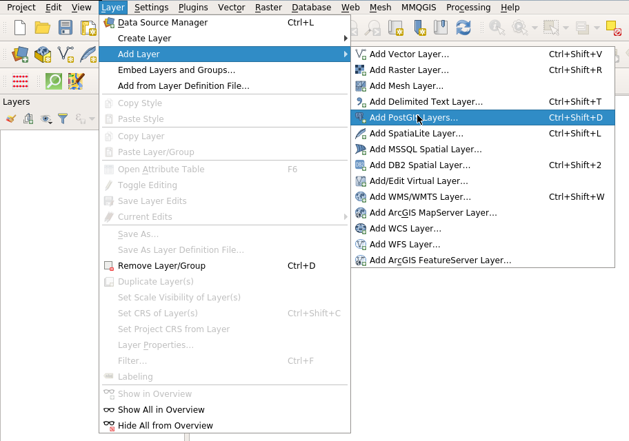
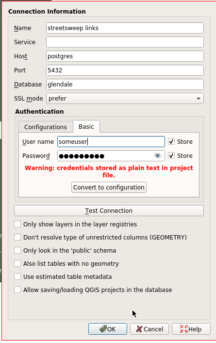
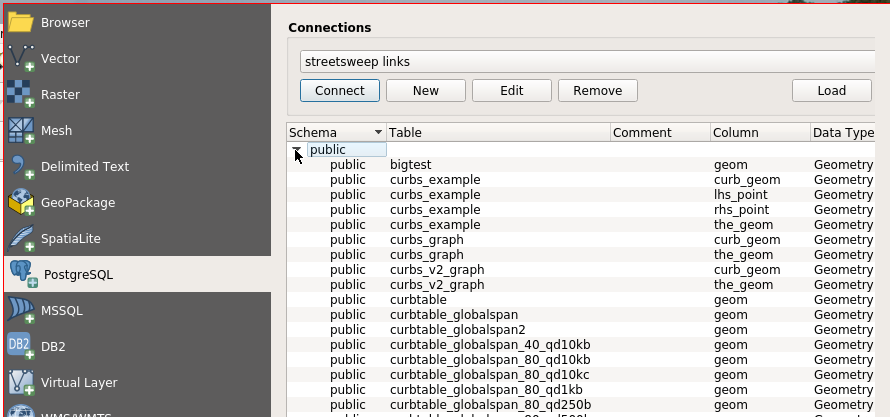
The reason I bothered with showing my Docker setup is that it has a direct bearing on how to link QGIS and PostgreSQL. The next two figures show this process. First, the “Layer” menu item drops down to “Add Layer” and “Add PostGIS Layers…”. Selecting this option will show a dialog with possible database connections. The first time through, one must select “New” button in order to pop up the QGIS dialog for setting up the database connection, shown to the lower right. In this dialog, I give the connection the name “streetsweep links”. Next I specify the host using the Docker container name “postgres”. Note this is not the name of the Docker network, but rather the name of the container on the network. If you insist on not using containers for QGIS and PostgreSQL, then of course the database host will be either localhost (127.0.0.1) or whatever host is appropriate for the DB. Next come the database name, and then the username and password. In this case I’ve asked QGIS to save the user name and password. It complains about this, but since my database is ephemeral by nature, I don’t really care.
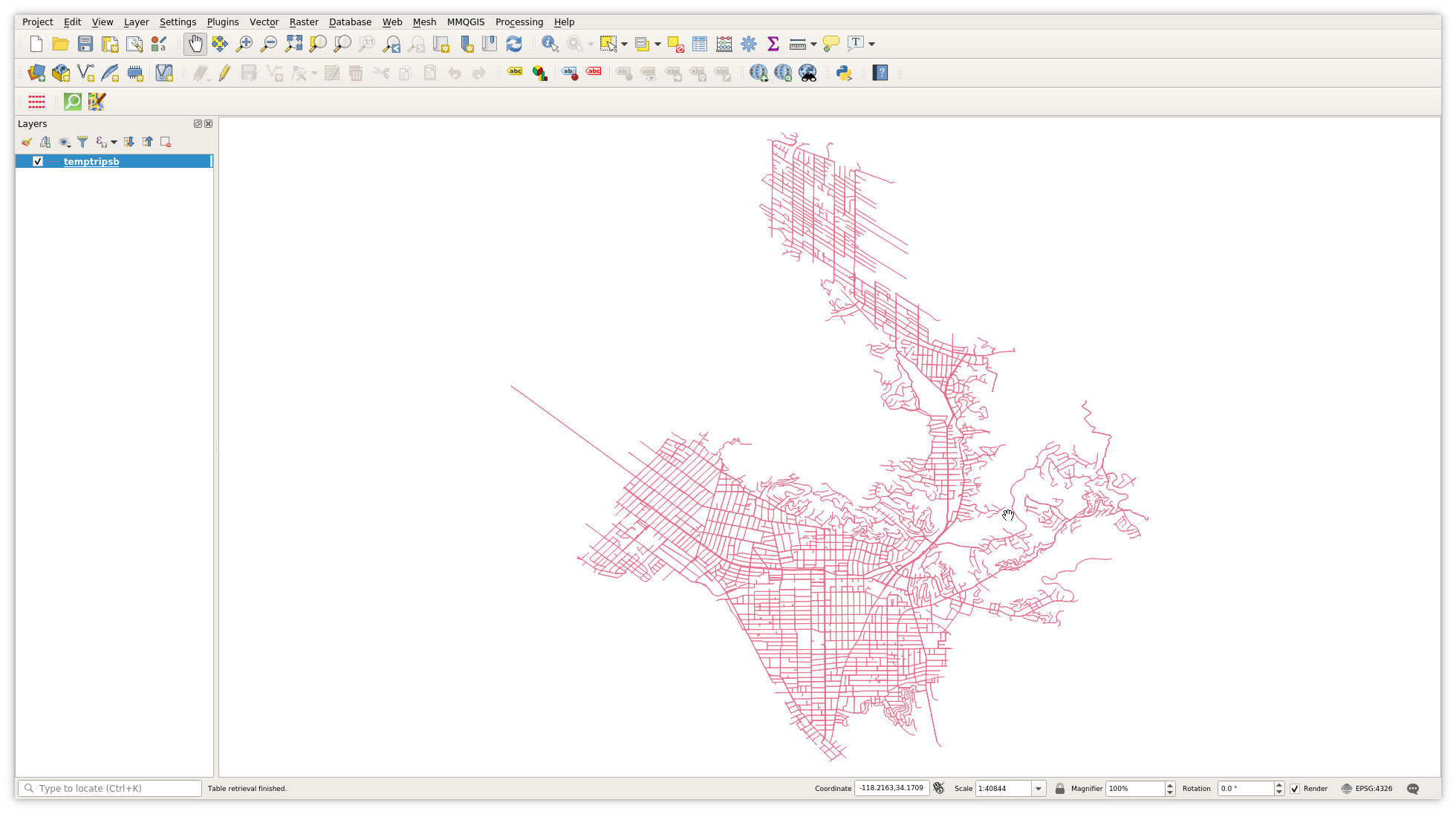
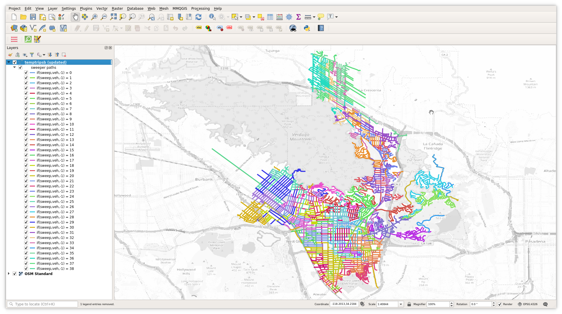
Once the database connection is established, you can view the tables in the database. Depending on the database setup variables chosen, you will either see all tables, or only those with geometries. An example dialog is shown below, left. (This is my actual working database, with lots of temporary tables showing the results of different solver variations—“curbtable_globalspan”, “curbtable_globalspan2”, etc.) The display of the generated street sweeping routes is shown below, right. (By the way, if you click on the figures, you will see a full-size version of the image which makes the text much easier to read without a magnifying glass.) The map of streets is quite boring, as no attempt has been made to style the map based on the characteristics of each row (vehicle number, sequence in route, etc).
The third screenshot from QGIS below shows each route colored based on
the vehicle. In addition, if you look closely, you can see I am only
coloring the street segment if its value of sweep is True. For this
display, all non-swept segments are ignored. Of course, other
stylings are possible, such as making non-swept segments dashed lines,
grouping routes by day and by vehicle, and so on.
What is clear from this map is that while the visualization is an improvement over a list of streets to visit, it is still very difficult to examine each individual route. One can see blobs of color clustered together which indicates that the per-vehicle routes are not too spread out, but it is hard to really see what is going on. The map compresses time so the route dynamics cannot be observed, and the routes are drawn right on top of each other, so it looks a little like a colorful plate of spaghetti. For these reasons, I decided it was necessary to animate each route, as I describe in the next section.
Animations of routes
I found two approaches to animating using QGIS. The first way is to use the “Time Manager” plugin by Anita Graser and Karolina Alexiou. It can be installed via the QGIS plugin manager, and its homepage is found at http://anitagraser.com/projects/time-manager/. Time manager works well, but its biggest flaw for this application is that it holds the viewport steady for the duration of the animation. That is, the spatial extent and zoom factor are fixed, and only some variable representing time is allowed to change. In this case, I was able to make an animation of individual routes, but showing the entire city made individual streets too small in the final animation.
By the way, the two routes shown here are for a circular subset of streets. This was an early test run just to see how to use the time-manager plugin. I never bothered redoing the animation with real routes.
Animation of two test routes using the Time Manager plugin. The viewport and zoom level are both fixed
The second way to animate QGIS content is to use the built-in atlas functionality. There are several HOWTOs all over the web if you search for “geogiffery”. I found this medium post very helpful: https://medium.com/@tjukanov/geospatial-animations-with-qgis-atlas-995d7ddb2d67.
The basic idea is to create a print layout, and then set up the atlas that controls the viewport to follow a map layer. The atlas follows the coverage layer item by item, with the items sorted by one of the fields in the layer. So in this case, the layer that the print layout follows is the route display layer, and the items are sorted by vehicle, and by the order of links the vehicle must visit.
The trick to generating an animation from this setup is to print out all of the individual images, and then stitch them together using ffmpeg. The zoom level is still fixed, but the viewport of each separate image is centered on the current item from the atlas layer.
The resulting animation is shown to the right. This animation shows the first two routes for a full 40-route solver run for the full city of Glendale.
Obviously, the animation is extremely choppy. The atlas functionality centers the map on each item in the atlas layer in turn. In other words, each street in the route is centered one after the other. This means the point of view of each frame will jump instantly from the center of one street to the center of the next street. Adding to the choppiness of the animation is the fact that long streets and short streets are shown for exactly the same amount of time in the resulting animation. Solving this jitter is the next and concluding section of this blog post.
Using ffmpeg to animate successive print layout atlas images. While the viewport can now move, the animation is extremely choppy
Smoothing the animation
The first aspect of the jitter that is easy to solve is to make each frame of the animation show the same amount of street coverage. This is done by slicing each street segment into consistent lengths. I arbitrarily chose to split up every road into 25 meter sections. This gives a reasonably consistent illusion of time passing. Choosing to split the roads into 1 meter segments would produce an even smoother animation, but that just adds too many frames, which greatly increases the amount of time required to produce the animations.
To chop up the roads, I use the SQL code shown next. This code is
slightly expanded from that given in the PostGIS documentation for
the ST_LineSubstring
function.
First, the lengths of the road segments are calculated. Then the
maximum length road is found. This longest road is used to make sure
that there are enough series elements (maxiter) to chop every road
into 25 meter pieces.
The “snipped” clause does the real heavy lifting of the statement.
The correct number of segments for each road are generated by CROSS JOIN-ing the “series” with each entry in the “lengths” clause of the
WITH statement. The roads will get snipped up into 25 meter
segments, plus one additional segment at the end for the remainder.
The “frame” variable is also constructed for each of the “snipped”
rows so as to keep each segment of the original roadway in order.
Finally, the WHERE condition s.n*25.00/len < 1 prevents creating
extra zero length snippets of roadway. For example, if a road is only
10 meters long, then there will only be one entry for it in the
“snipped” result, with s.n=0. This is because if s.n=1 and
len=10, then 1*25/10>1, and so that row and every row with
s.n>=1 will be dropped from the cross join.
SQL WITH statement to slice up streets into 25m segments
with
 lengths as (
   select id,linkid,veh,sweep,geom,
          st_length(st_transform(geom,32611)) as len
   from solver_output
   order by id ),
 maxlen as (
   select max(len) as len  from lengths ),
 maxiter as (
   select (ceil(len/25.00)+1)::int as maxiter
   from maxlen ),
 series as (
   select maxiter, generate_series(1,maxiter) - 1 as n
   from maxiter ),
 snipped as (
   select id, id+(n/maxiter::numeric) as frame,
     linkid,veh,sweep,
     st_linesubstring(geom,
          25.00*n/len,
          case when 25.00*(n+1) < len then 25.00*(n+1)/len
               else 1
          end) as geom
   from lengths l
   cross join series s
   where s.n*25.00/len < 1
   order by frame )
The video to the right shows the result of animating the new data layer. Whereas the earlier animation has just 640 frames, the new one has 2360 frames, after the long roads are broken up into 25 meter sections. This makes the resulting file larger (2.3MB versus 1.8MB) but the extra size is worth it.
Another advantage of breaking up the road is that I can now show the progress of the “vehicle” along each street. To do this, I’ve added an extra layer to the map that consists solely of an arrow that is placed in the middle of each 25 meter segment and oriented along its axis. Then instead of showing all items that have an id that is less than or equal to the atlas frame id, I instead just show the item that has an id equal to the current atlas id. This means just one arrow is shown on the map, while the historical track of visited streets is persisted on the map. This arrow also helps to improve the animation, as it is much easier to follow the arrow than to spot the newly added colored line segment in the earlier animation.
In terms of smoothing the animation, this version is much better than the earlier one, but it still isn’t very smooth. The animation starts off fairly promising, with a much smoother movement for the first few streets, but then as the route takes the vehicle into short road segments the animation starts to spasm and shake as it centers the frame back and forth over small changes in direction.
Animation generated from 25m road sections. The animation is smoother but is still jerky, especially when the vehicle direction changes
The key insight to making a smooth animation is that the atlas layer does not need to be visible. That is, while the atlas is defined by an ordered list of spatial objects or points, those point can be invisible in the resulting animation. Because I want to “smooth” the animation, it seems pretty obvious to me that the correct thing to do is to produce a running spatial average of the streets being traversed.
The spatial average is generated by using the PostGIS function
st_collect in its aggregate form, coupled with a PostgreSQL window
function.
I tried a few different approaches to defining the moving frame, and I
liked the look of the leading average shown in the code to the right.
The averaging window consists of the two streets before the current
street, the current street, and then ten streets after the current
street. This spatial centroid of this aggregate of streets will
therefore “lead” the red arrow, which gives the viewer a hint as to
where the arrow is going next.
SQL WITH statement to compute centroids of the 25m sections of streets over a sliding window (2 preceding, 10 following)
with
  idgeom (uid,geom) as (
    select uid,
      st_collect(geom)
      over (order by uid
            rows between 2 preceding
                    and 10 following)
    from results_snipped  ),
  centroids as (
    select uid,st_centroid(geom) as geom
    from idgeom  )
insert into pov (uid,geom)
select uid as uid,geom from centroids;
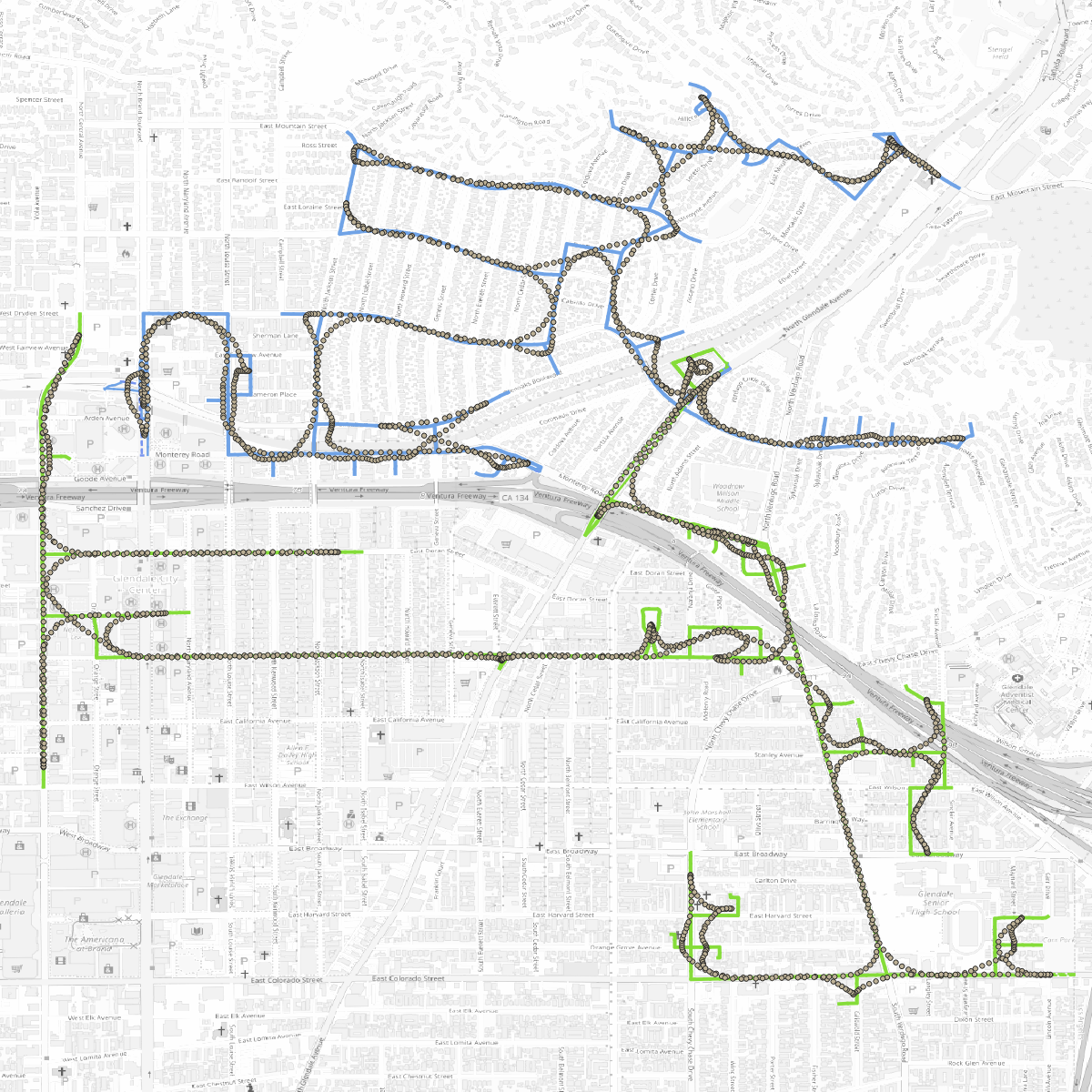
The POV points for the first two routes generated using the above code are shown to the right. The areas of “jitter” in the previous animation have very tightly spaced POV points, but the points move in a smooth curve, rather than jumping back and forth.
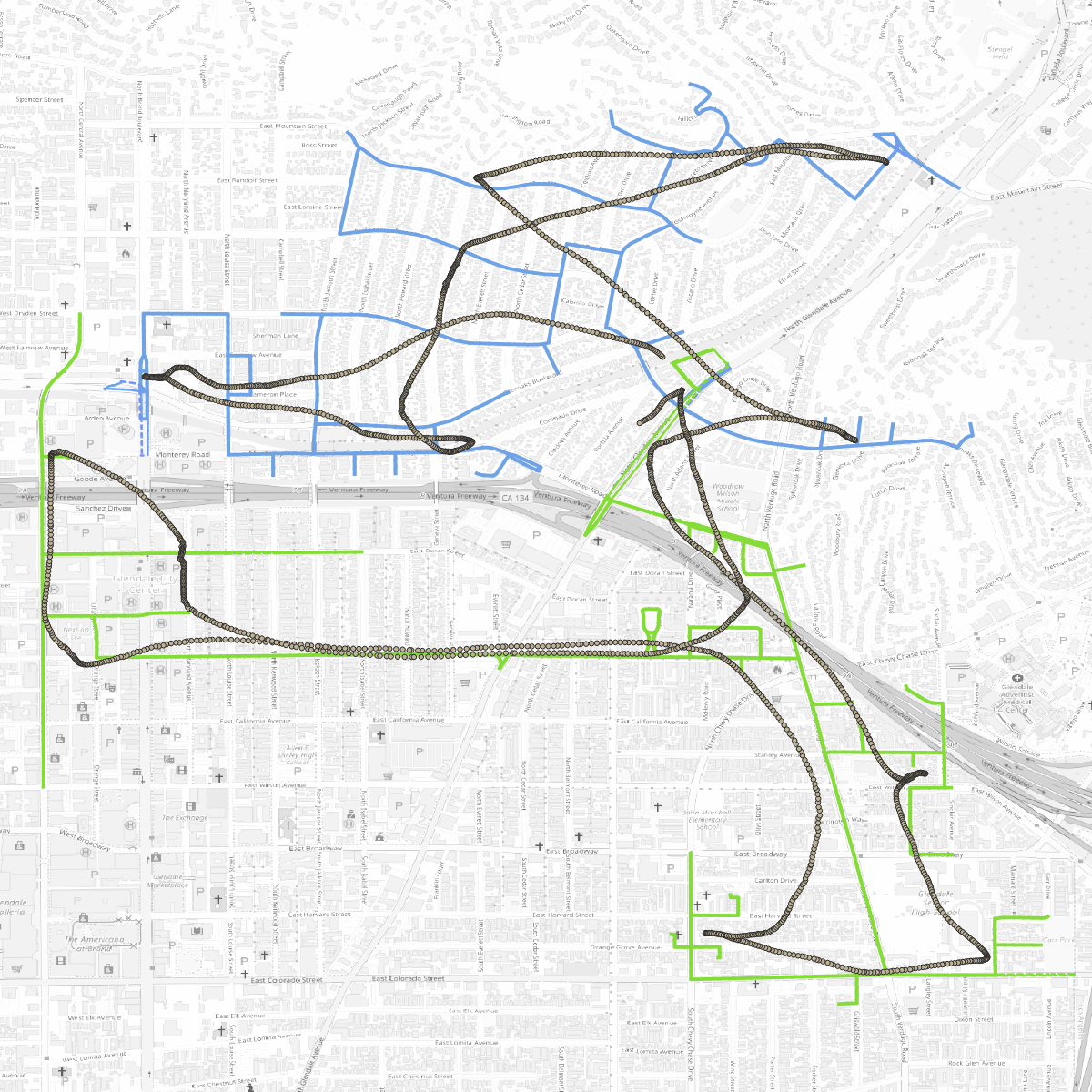
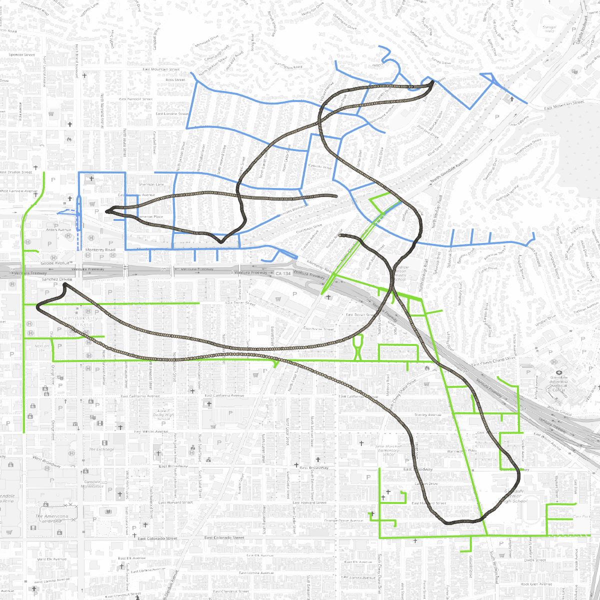
Something I’ve been thinking about is whether the POV points for a route can be used to characterize it in some way. By taking larger and larger windows, the resulting POV points will converge on the centroid of the total route, so perhaps this can be used as a measure the dispersion of a route. The two pictures below demonstrate this idea. The one on the left shows a POV window starting 40 streets earlier and ending 50 streets after—still cheating towards the upcoming streets, but with a much wider average. The picture below right shows the POV points for a window that averages over 90 streets before and 100 streets after the current street. The POV layer gradually loses the extreme detail, but it still captures the gross movements of the route.
The computed centroids overlaid on top of the two routes, using the sliding window [2 preceding, 10 following]. The centroids still track the route closely, but the averaging smooths out the curve
The computed centroids using the sliding window [40 preceding, 50 following]. The centroid track smooths out the details of the routes
The computed centroids using the sliding window [90 preceding, 100 following]. The centroid track still preserves the overall shape of both routes
The final videos below show the result of using the POV layer to center the atlas. On the left is the one with the [-2, 10] sized POV window, and on the right is the one with the [-40, 50] sized window. I like the dynamic camera of the left animation, but I think I prefer the right one as the vehicle is allowed to use the whole frame. The [-90, 100] POV window needs to be zoomed out a bit more, as the truck keeps running off the page, so I didn’t bother adding it here. My daughters think the frame rate is still too low, but I think it is pretty good. Perhaps not good enough for Pixar, but certainly good enough to evaluate the quality of the routes.
The tighter averaging window [-2, 10] results in a smooth but active camera position that keeps the vehicle roughly centered in the frame
The wider averaging window [-40, 50] results in less active camera position that gradually pans, letting the vehicle use more of the frame
So far I haven’t wrapped all this up in a script or a Python program that I can tack on to the end of the solver program. QGIS does have a Python scripting framework, so it shouldn’t be too hard to do. However, I think it is okay to poke and prod a bit in QGIS manually, as it gives me a chance to get a good view of what the individual and overall routes look like after I change the solver parameters. I also haven’t set things up yet to animate all of a day’s routes at once, but that should be pretty easy to do.
Thanks for reading to the end. Next up in this series I will finally dive into some approaches I’ve been testing for generating decent street sweeping routes using OR-Tools.
One more thing
Edit: after writing the above, I changed the scripts into functions in order to play around with different “snip” sizes and different aggregations for the POV computation. My conclusion is that snipping the routes up at 10 meters, keeping the POV averaging relatively the same (1000 meters behind, 1250 meters ahead), and running the ffmpeg generation step at 60 frames per second is the best for my purposes. Even my daughter agreed that the results are smooth like butter.
Smoothest animation is with 10m slicing of routes, and a window that is [-100, 125] segments, which is about 1000 meters before, and 1250 meters after the current point in the route. The FFMPEG command merges the images at 60fps
